Rebranding: Annapoorna
Client: Sree Annapoorna Sree Gowrishankar Hotels Pvt Ltd, Coimbatore
REBRANDING, BRANDING, BRAND STATIONERIES DESIGN, LOGO DESIGN, BRAND BOOK DESIGN, WEBSITE DESIGN, RETAIL EXPERIENCE DESIGN, ADVERTISEMENT DESIGN, POSTER DESIGN, GRAPHIC DESIGN
The goal of the project was to rebuild the Brand Identity of Sree Annapoorna Sree Gowrishankar for bringing in a younger, more vibrant and contemporary appeal for the brand. We were assigned the task of revamping the aesthetic and visual language of the brand through a seamless convergence of tradition and modernity.
Before / After: The image shows the old logo of Sree Annapoorna Sree Gowrishankar. Move the slider from left to right to see the new logo.
Sree Annapoorna, with 16 restaurants spread across Coimbatore, is a well-established brand with a set of powerful brand assets. In the journey ahead, as the brand prepares to expand its geographical boundaries and reach out to a broader customer base, a rethinking and a reconstruction were required to make sure that the brand image of Annapoorna, which was created half a century before, embraces a forward-looking approach and embodies a futuristic spirit. To create an aesthetic and visual language that follows this modernistic approach and at the same time, reveres and preserves the goodness of tradition, the brand had to go through a well-thought-out and carefully executed rebranding process. We were assigned the task of bringing forth a seamless convergence of tradition and modernity and thus facilitating a methodical evolution of a visual identity that reflects the future of the brand.
The journey that has spanned over 60 years was closely studied during the research conducted in the initial stages of the rebranding process. The brand had created a strong and positive brand image. A store that sold Keera Vadai and Filter Coffee in Central Theater, Coimbatore in the 1960s is a multicore hospitality brand today. People are familiar with the brand and they instantly associate the brand with South Indian food. The brand has a solid foundation of trust and goodwill. Brand loyalty is high. The visual identity of the brand has a strong impression on the customer base. Redefining the identity of this powerful brand was a huge challenge, probably the most challenging rebranding project we had done till then.


A bit about how we crafted the experience
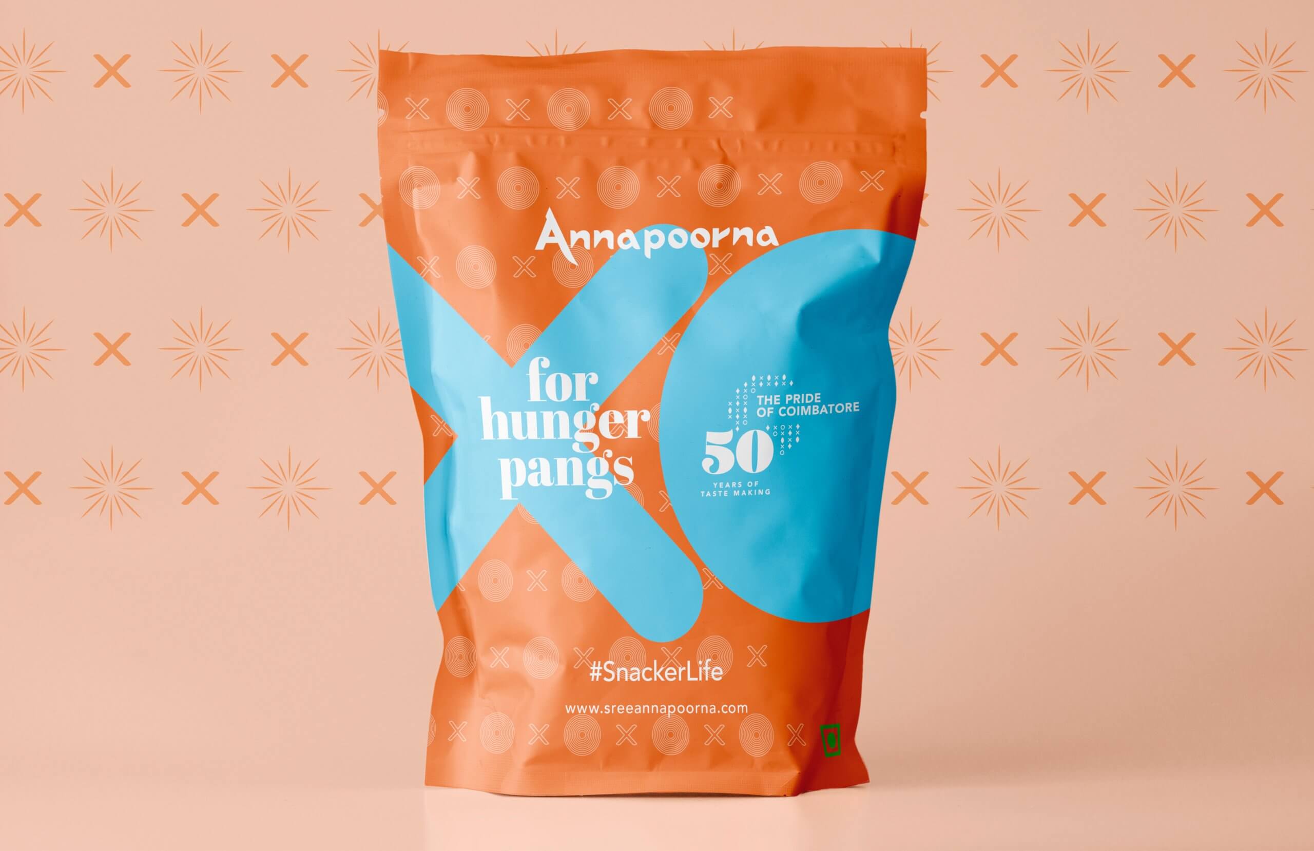
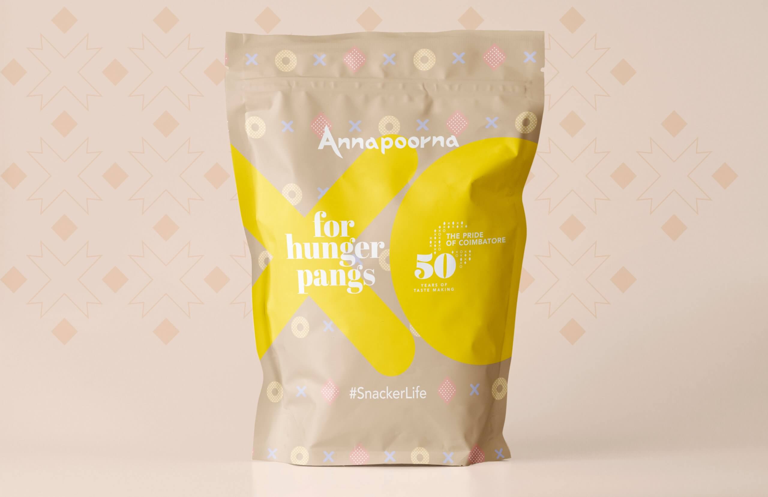
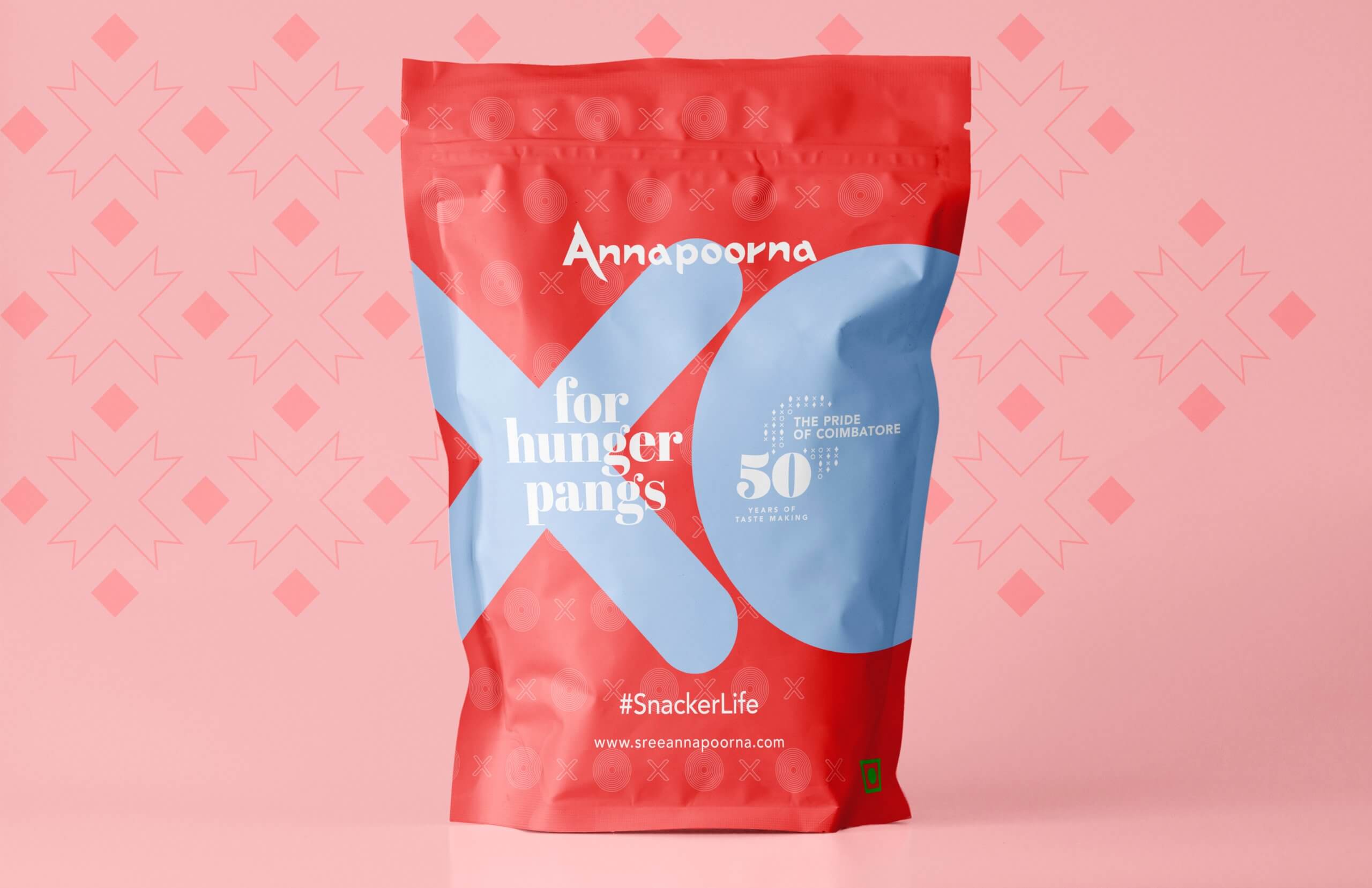
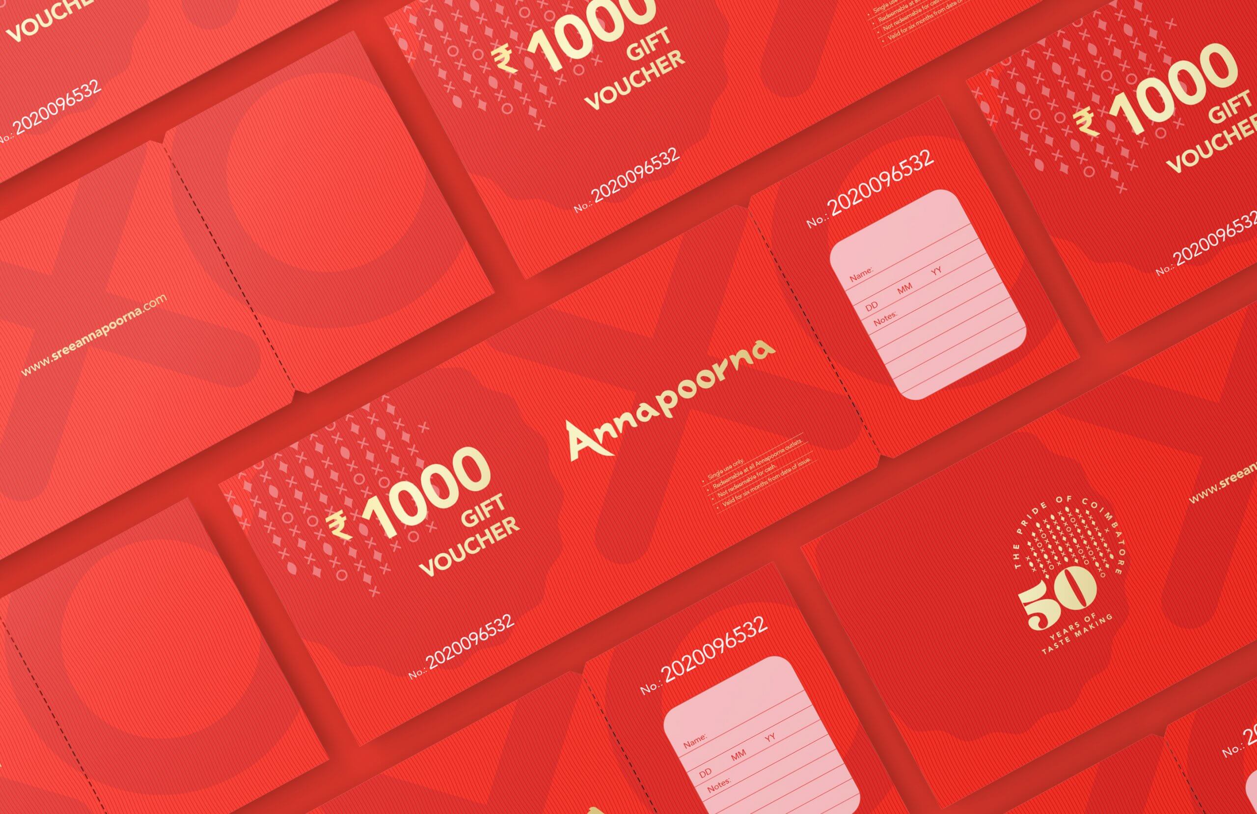
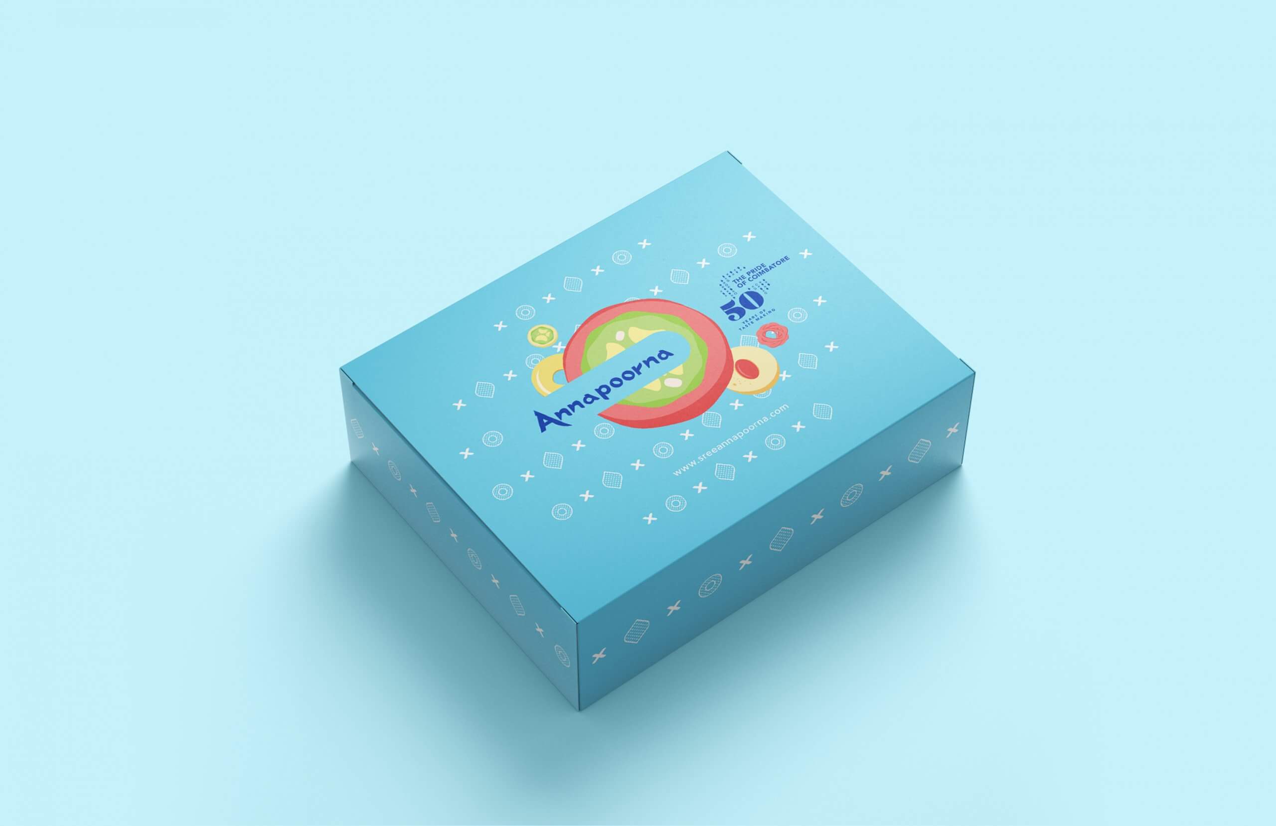
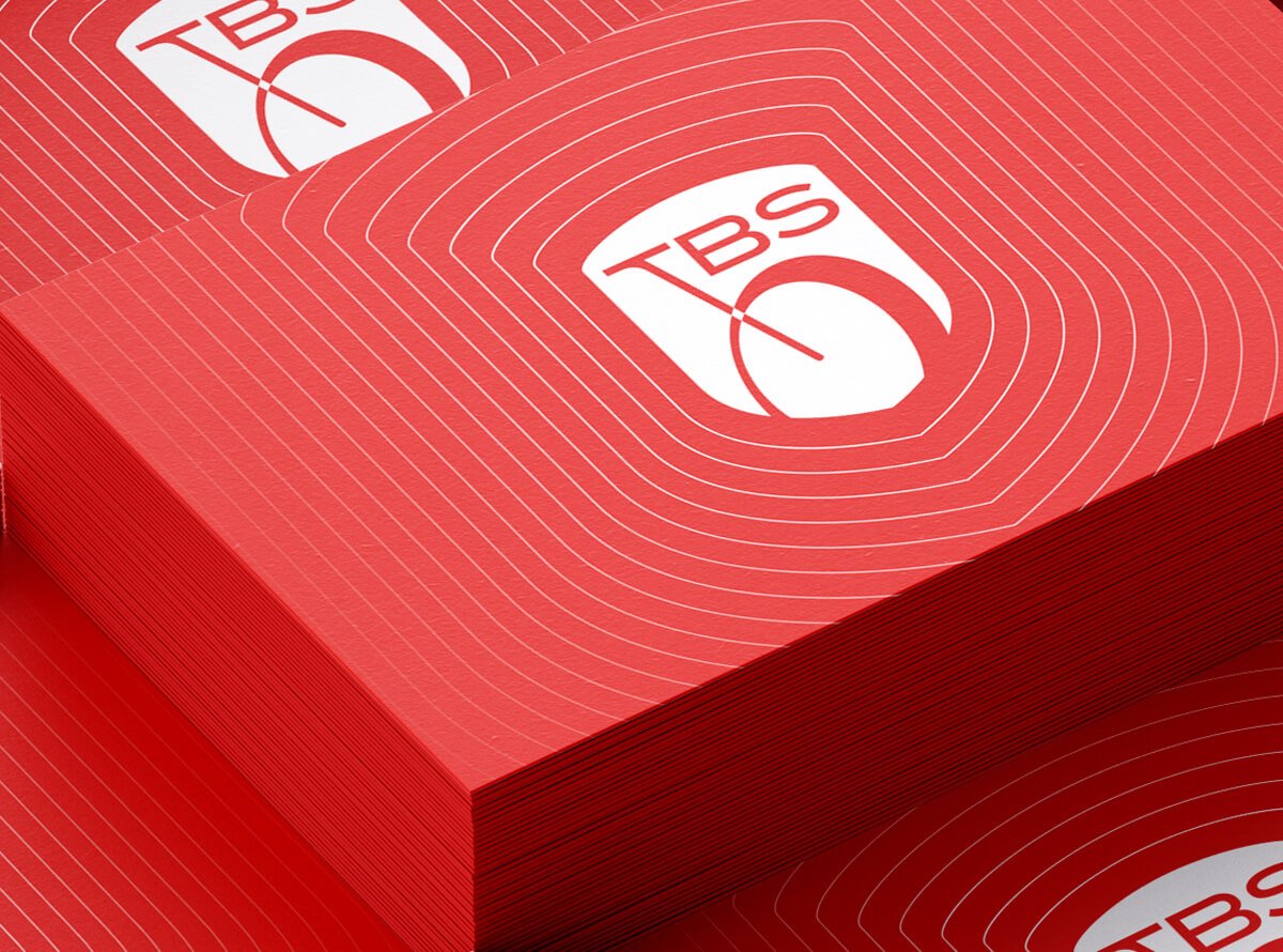
We redesigned the logo by maintaining the overall visual structure so that the familiarity is retained. The font is simplified and the logo mark as a whole is trimmed to create a more minimal and sleek aesthetics. The typeface is redesigned with the intention of transitioning to a more bolder and symmetrical lettering and crafting a sleek and elegant identity.
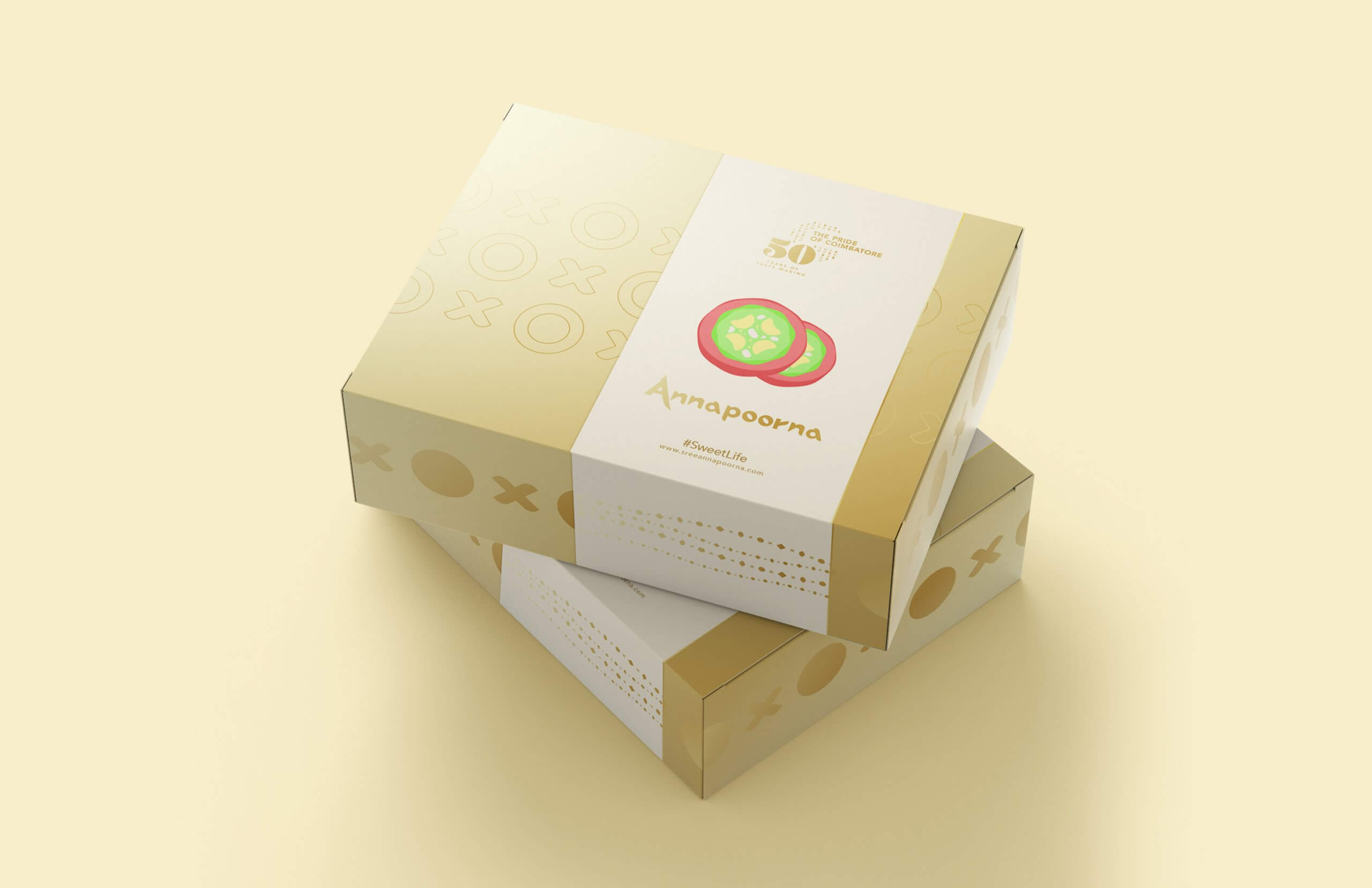
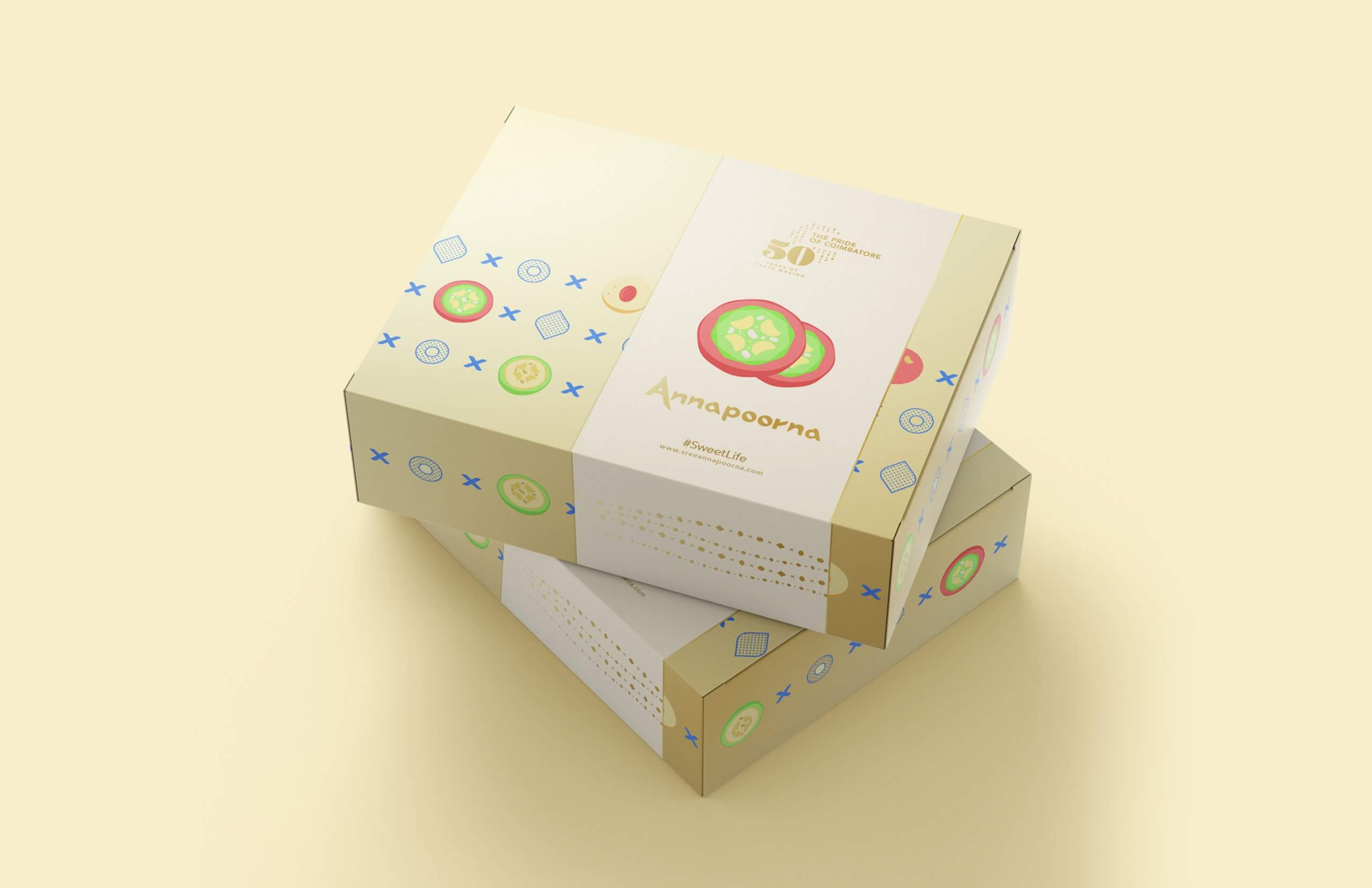
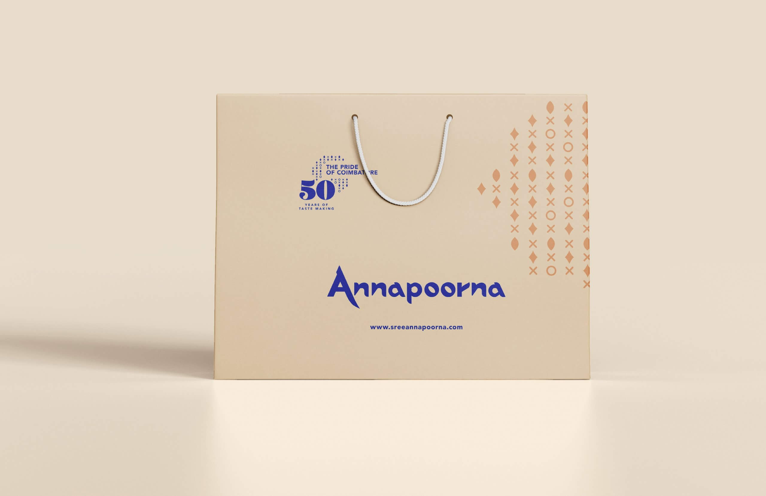
For Annapoorna, the colour is a predominant element in the brand impression and recall. This was a part of the rebranding that had to be done in meticulous and diligent manner to make sure that the popular appeal of the brand is not threatened in any way.
Through research and client interactions, we concluded that perhaps the blue used as the brand colour was a choice made during a time when screen printing was popularly available in that shade of blue. The blue, which could be an outcome of a decision based on production efficiency, became a vital element in the identity of the brand. We used this as the base palette and developed a primary colour palette.

Logo Inspiration: Hey there, this is the default text for a new paragraph. Feel free to edit this paragraph by clicking on the yellow edit icon. After you are done just click on the yellow checkmark button on the top right. Have Fun!
Pattern Inspiration: Hey there, this is the default text for a new paragraph. Feel free to edit this paragraph by clicking on the yellow edit icon. After you are done just click on the yellow checkmark button on the top right. Have Fun!

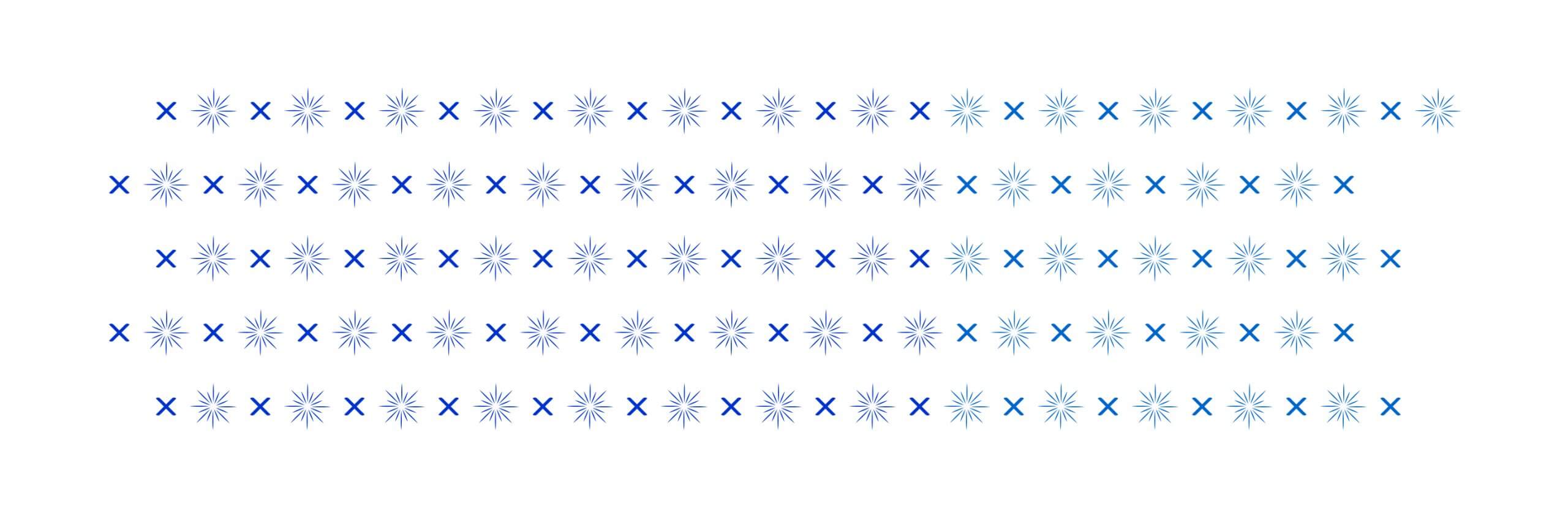
Pattern Exploration: Hey there, this is the default text for a new paragraph. Feel free to edit this paragraph by clicking on the yellow edit icon. After you are done just click on the yellow checkmark button on the top right. Have Fun!
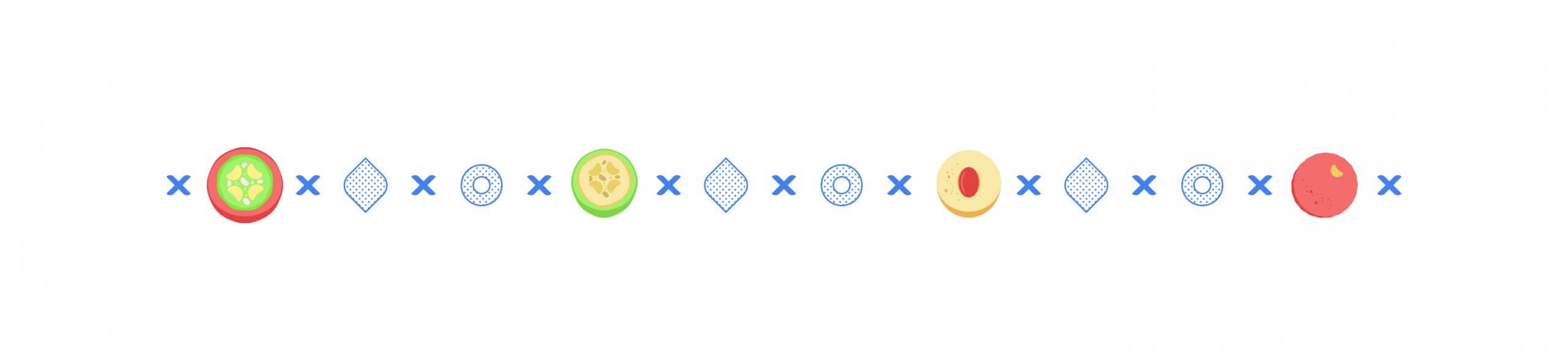
Pattern Exploration: Hey there, this is the default text for a new paragraph. Feel free to edit this paragraph by clicking on the yellow edit icon. After you are done just click on the yellow checkmark button on the top right. Have Fun!
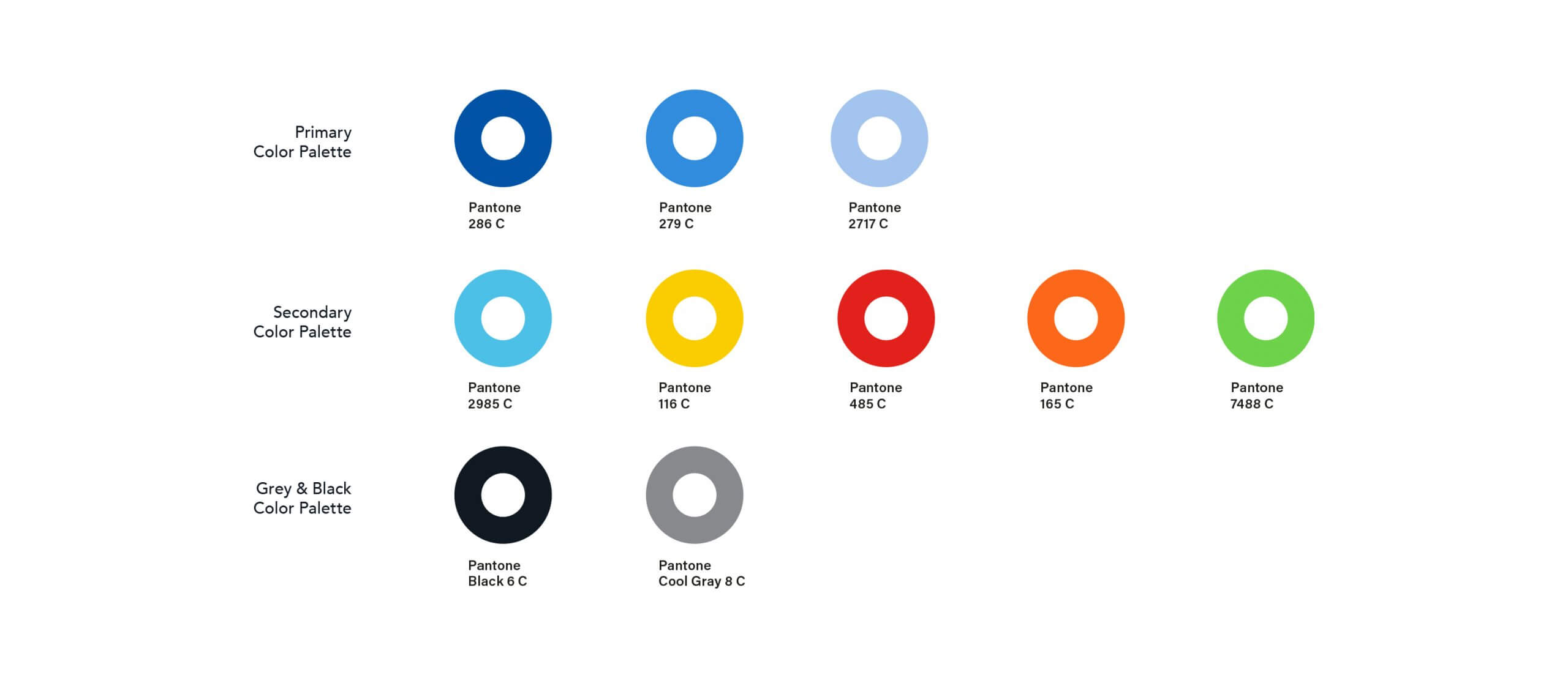
Brand Colors: Hey there, this is the default text for a new paragraph. Feel free to edit this paragraph by clicking on the yellow edit icon. After you are done just click on the yellow checkmark button on the top right. Have Fun!
50 Year Celebrations Mark: Hey there, this is the default text for a new paragraph. Feel free to edit this paragraph by clicking on the yellow edit icon. After you are done just click on the yellow checkmark button on the top right. Have Fun!
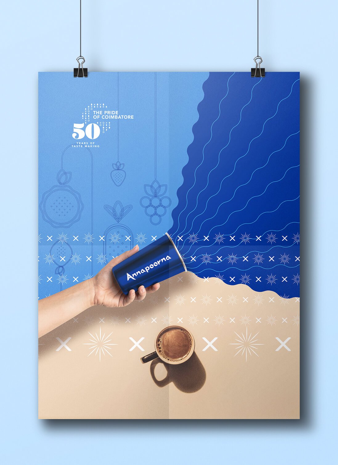
Art Poster: Hey there, this is the default text for a new paragraph. Feel free to edit this paragraph by clicking on the yellow edit icon. After you are done just click on the yellow checkmark button on the top right. Have Fun!
Selected Works
AnnapoornaBrand Identity Design
The BikeStoreBrand Identity Design